
Research notes visually identifying intervention effects
It will come as no surprise to people here that I think the concept of determining the impact of some event by looking at whether a line went up or down around the time of that event is farcical. I also realize that talking about the ‘correlation isn’t causation’ cliche to a bunch of statistically literate people is totally unnecessary. Yet, I feel compelled to write about this phenomenon because it’s so pervasive in my life:
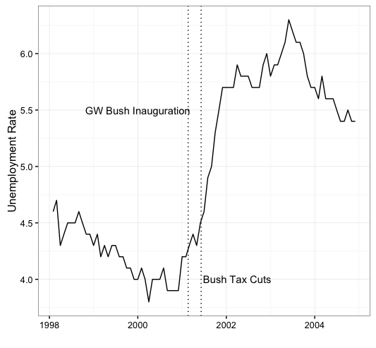
the Bush tax cuts caused a huge spike in unemployment. See, look at this chart!
Clinton blew up the national debt. See, look at this chart!
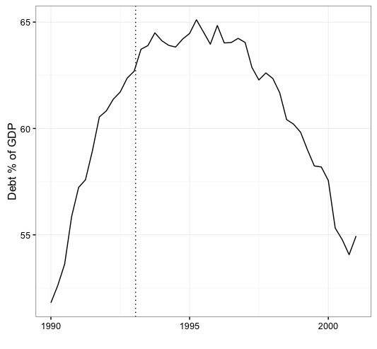
Disclaimer GW Bush may have imposed upon us policies that lead to massive unemployment and Clinton may indeed have blow up our budget. They MAY have…but the charts above certainly don’t conclusively demonstrate either of those points. There do appear to have been changes in unemployment and the national debt AROUND the timing of those two administrations. But we take a deep breath and try to get away from our own cognitive biases it’s pretty easy to see that our national unemployment rate was ticking up well before W took office…AND our national debt was certainly in the midst of a pretty solid expansion when Clinton took office.
I had a thought the other day that the proper way to demonstrate whether one can actually infer intervention effects on a time-series from just looking at the series isn’t to look at when the intervention occurred and what happened to the data ex-post…it’s to look at some unlabeled data and ask whether one can identify the effect they think occurred if it’s not immediately clear where on the chart the intervention took place.
Basically, I’m thinking of an experiment to demonstrate the limits of just looking at a data series to see if some event had an impact:
The first step would be to get a panel of people together and show the panel several different hypothetical charts of some pop-news economic indicator like the Dow Jones Industrial Average, Unemployment Rate, or S&P 500 Index around the time of a policy change (I’m thinking specifically here about new presidential adminstrations but it could be anything: a tax cut, a war, a minimum wage hike, etc.). The idea would be to see how many different ways people could attach meaning to random lines on a chart if they were told that those lines represent things that they thought should have an impact.
Example: Here are 2 charts of hypothetical movements in the stock market. What if I told you that the dotted line in the panels represents the beginning of Quantitative Easing (expansionary monetary policy)?
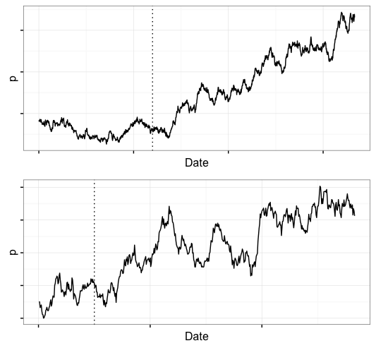
For the top panel you could say:
- yes, clearly the market was in a funk leading up to the policy, then shortly after the policy the market took off, or
- no, if there was an effect it should have been immediate because the market anticipates future changes and monetizes them immediately through investor confidence.
For the bottom panel you could say:
- yes, there was an effect because the market was trending up but the rate of increase clearly accelerated after the policy.
- no, there is no reason to think - based on this plot - that the general upward trend in the market was altered by the policy.
Outline
What I’ve cooked up here is kind of trivial but sort of fun.
-
First I generated some time-series data from a purely random process. I defined an event date at some point in the time-series and draw a vertical reference line at the event date. The point here was to illustrate to myself how often, in a totally random process, we observe behave that - if one were looking at it ex-post - would look like an effect of the event on the time series.
-
Next, I use actual data from the Federal Reserve on the monthly unemployment rate. I present this data with the dates stripped away from the x-axis in order to reinforce:
- how easy it is to say President so-and-so had a positive or negative effect on the unemployment rate by observing movement in the series AROUND the time of that president’s tenure, and
- how difficult it is with an unlabeled time-series to say where a President’s hypothsized impact began.
- I relate these examples back to the issue of p-hacking and the garden of forking paths that Andrew Gelman often writes about.
Simple Simulations
Here I have simulated three time series with purely stochastic properties. I used Geometric Brownian Motion. This has implications for the claim I’ve seen that Trump is great for the stock market because he’s a business man and he’s given investor’s confidence in the future of the market….AND we know it’s true because we can look at market indexes and see that they have been going up under the Trump administration. Our domestic equities markets are generally considered to be one of the closest things we have to a pure random walk process. Geometric Brownian Motion is a good way to capture this type of movement.
The Equation for Geometric Brownian Motion is pretty straightforward. The process $S_{t}$ follows GBM if it satisfies:
\[dS_{t}=\mu S_{t} dt + \sigma S_{t} dW_{t}\]where $W_{t}$ is a Weiner Process.
GBM has drift (measured throught the constant $\mu$) and stochastic volatility so it’s a decent approximation to the behavior of our stock market.
The important thing to note here is that there is no break in the underlying data generating process - any movement in these time series that appears to be structural change or intervention effects is simply the result of a stochastic volatility inherent in Geometric Brownian Motion.
This is pretty ad-hoc but here is what I did:
- defined an interval from Jan. 2012 to Dec. 2017 with a time step of 1 day
- generated 5 sequences in that interval defined by basic Geometric Brownian Motion
- plot each of the 5 sequences with a reference line at Jan. 20, 2017 or Nov. 8, 2016
I repeated this process 3 times. In each of the 3 runs of 5 simulations I found at least one series that I claim could be explained by a ‘pattern finder’ as evidence of noticeable change in the time series attributable to the new presidential administration that became imminent on Nov. 8, 2016 and took office on Jan. 20, 2017. Below I present 1 time-series from each of the 3 simulations of 5 time-series and I annotate how a reasonable person might explain the effect of the intervention based on the dynamics of the series.
Here is the simple code I used to generate my GBM series:
library(sde)
dates <- seq.Date(as.Date('2012-01-01'),as.Date('2017-12-05'),by="day")
T <- 1
n <- length(dates)
mu=0.4; sigma=0.3; P0=1;
dt=T/n; t=seq(0,T,by=dt)

x <- GBM(x=P0,r=mu,sigma=sigma,T=T,N=n)

plot.df <- tbl_df(data.frame(dates=dates,p=x[1:length(dates)]))
ggplot(plot.df,aes(x=dates,y=p)) + geom_line() +
  geom_vline(xintercept=as.numeric(as.Date('2017-01-01')),linetype="dotted")  +
  geom_vline(xintercept=as.numeric(as.Date('2016-11-08')),linetype="dotted")  +
  theme_bw() + theme(axis.text.y=element_blank()) +
  xlab("") + ylab("")
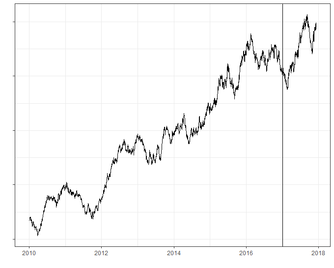
The “it takes a couple months to implement policy” example
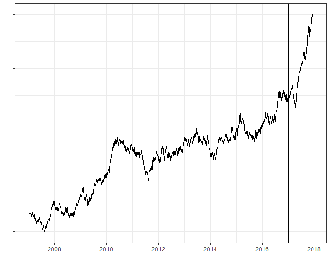
In this example, if I told you there was a new administration that took office on Jan. 20, 2017 and if you were predisposed to believe that the new administration was “good for business” you might look at the following time series and say:
Obviously Trump has been good for the market. You can clearly see that the market had plateaued before the inauguration then jumped when Trump took office. Then it went through a natural correction because that’s just what markets do, then it took off again.
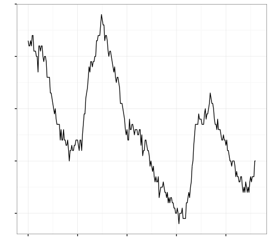
The “stop the bleeding” example
This example is similar to the previous one with one exception: the series hits a down draft before Jan. 20, 2016, continues down for a few periods, then bottoms out and head back up. Again, if you knew there was an event on Jan. 20, 2016 and you looked at the data to determine if this event had an impact you’d probably say,
Obviously, the series was trending down when the intervention hit, it took a few periods for the intervention to have an effect because sometimes markets take a minute to digest important events, then the real impact of the intervention is seen in the subsequent increase in the time series.
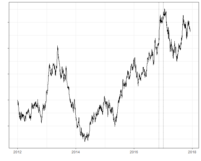
The “high expectations” example
In this example I include vertical bars for the date of the election (Nov. 8, 2016) and the date of the inauguration (Jan. 20, 2017). If one were predisposed to believing the “business loves this president” argument one might look at this series as say,
Well it’s pretty clear to me: the market popped when the results of the election became known because investor confidence skyrocketed at the anticipation of a new “business friendly” administration. Then Trump took office and the market dipped a little because markets always tend to dip at the beginning of the new year. After the little correction (and a little time for this policies to take effect) the market took off again.
Summary
Our brains love patterns and are pretty good at finding them. If you show me a time series with ups and downs my natural inclination is to think about what happened around the time of those ups and downs and try to attach some meaning to those events.
I want to stress that what I’ve presented above has 0 underlying meaning. These are nothing but generations of a totally random process…but when I put dates on the x-axis people naturally orient themselves toward attaching meaning to the movement in the series based on the dates.
This doesn’t mean that interventions don’t have effects. What it does mean is that it is embarrassingly easy for a completely random series to LOOK LIKE an intervention effect.
Shifting Gears
My next example deals with another economic indicator. I won’t tell you which one just yet. Somewhere in the time-series below is the first day of Bill Clinton’s presidency and the first day of George W. Bush’s presidency:
OK, I won’t keep you in suspense forever. It’s the unemployment rate and here are the markers for the Bush and Clinton inaugurations.
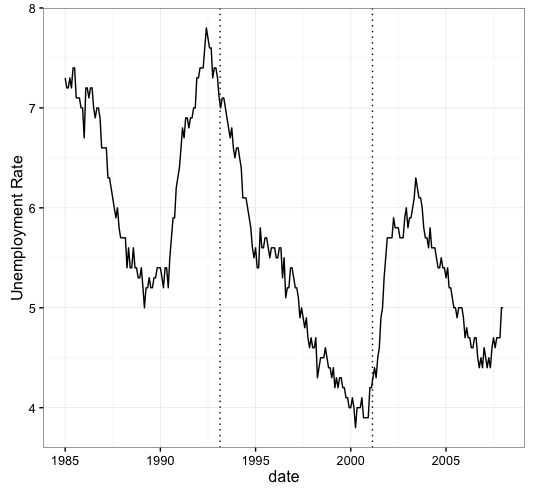
So did Bill Clinton’s economic policies the unemployment rate to drop? Maybe. Did George Bush’s economic policies cause the unemployment rate to go up? Maybe. But we sure as shit can’t tell just from looking at lines on a chart….and anyone who tells you otherwise is selling snake oil.
my main claim is that if I tell you this is the unemployment rate and, based on the movements, can you tell me where the regime change was? you would probably draw the lines somewhere around the bottoms or tops of local peaks and troughs because we have this idea that presidents’ policies DO influence the unemployment rate. But if I didn’t put any dates on the x-axis you wouldn’t be able to date the administration changes perfectly. It’s only AFTER I tell you where the breaks are that you can then go back and say, “Oh, that makes sense because the line was going down then it started going up.” Basically we always explain why patterns we think should be in the data are really there based on some ex-post examination of a time-series…but if we can’t dates those changes ex-ante then I believe, we have to admit that there are irreconcilable limits to how much causality we can infer from a line and some dates.
Garden of Forking Paths
Ok, so we can probably all agree that we should stop listening the CNBC, CNN, MSNBC, or FOX News when some pundit on their network says
QUANTITATIVE EASING BLEW INFLATION THROUGHT THE ROOF. DON’T BELIEVE ME? LOOK AT THIS CHART! FUCKING LOOK AT IT!
But even if we accept my basic plea to be a little more rigorous in our thinking about intervention effects, we are still left with Gelman’s famous GARDEN OF FORKING PATHS.
In digestable terms the Garden of Forking Paths says that if we test 100 different hypothesis there is a decent chance that at least one of those tests will turn up a false positive. So if we think that Trump’s administration has had a measurable impact on the economy through the stock market then we are in essence saying that there should be a structural break in stock market time series somewhere around Trump’s election. The Garden of Forking Paths is what happens when try to statistically test for our hypothesized effect like this:
Q1. Does the series exhibit a break in Jan. 20, 2017?
A1. No.
Q2. Well, does the series exhibit a break in Nov. 8, 2016?
A2. No.
Q3. It seems more likely that any positive effect would manifest itself AFTER Trump took office…so how ‘bout a break in Feb, 2017?
A3. No.
Q4. March, 2017?
A4. No.
Q5. April 4th, 2017?
A5. No.
Q6. April 20, 2017?
Q6. Yatzee!!
Appendix
I’m going to go ahead a put a few things down here just in case people want them:
The time-series on the national debt is here:
https://fred.stlouisfed.org/series/GFDEGDQ188S